Monday, 25 March 2013

The Trailer (First Draft)


To create the trailer up to its current state i used the following clips:
http://www.youtube.com/watch?v=lgpOfVsw62g
http://www.youtube.com/watch?v=FhEYvOYceNs
http://www.youtube.com/watch?v=Tfr2-gDL9qo
http://www.youtube.com/watch?v=0UvUbnEenGE
http://www.youtube.com/watch?v=l5Y5SyjbHAA

I started off with by cutting all of the clip out of the source footage by opening the source footage and setting the start and end markers of each clip then dragging the clip into the clips bin. For the music i only dragged the audio out into the audio bin. I then started by dragging the the PEGI 12 clip onto the timeline. I then added the clip of the robot combat scene followed by the clip of the drop ship. I then faded it in using the opacity settings by clicking on the timeline with the pen tool to add points to the opacity line then dragged the one at the beginning all the way down.
After these three clips i added a title with the text 'IT'S COMING' then adjusted the scale on the first and last frames using the keyframes making the title on the first frame smaller than the title on the last frame so that the title zooms in to give dramatic affect. I also faded the title in and out using the same technique as before. I then added the asteroid collision clip and slowed it down by 50% and enabled frame blending to make the animation smoother. I then faded it out using the same technique as before and added the clip of the robot powering up after it. I then left a space after this for text to be inserted since i was going to do this in after affects to add some effects to it. After this space i added the clip of the robot's eyes lighting up and faded it in and out using the opacity controls.

After adding all of the clips, i unlinked all of them,except the PEGI 12 clip, from their audio tracks and deleted the audio. Then replaced it with the audio clip i made earlier, I zoomed in on the audio near the start of where the title would be then cut the audio track with the razor tool. I then zoomed in on the end of the intense part of the song and split that part too with the razor tool. I then removed the piece i had cut out then moved the rest of the song up to the start of the title. I then faded the song out at the end using the same technique as before except with the volume controls.

I after looking back through what i had made i saw that i could make the scenes look better by adjusting the colour and contrast so i added colour balance and contrast effects to the first two clips after the PEGI 12 clip. On the first of the two i set the the green highlights to -50 and the blue highlights to -29 and then set the contrast to 20. This helped to make the scene look less washed out and gave the scene more of a deeper colouring. On the second clip i set the green and blue highlights to 10 and reduced the red highlights to -40 to make the scene look more like its an earth type planet at around midday. It also brought the blue colour out on the vehicles to match the colour scheme of the title and cover DVD Cover. I added an RGB Colour Balance to the asteroid collision clip and increased the reds from 100 to 150 to make the colours more vibrant as there is a lot of red in the scene. This also shifts the scene to a more orange colour which goes with the orange and blue scheme i have on the cover. I then added an RGB Colour Balance to the scene of the robot powering and increased the blues from 100 to 125. Going higher than this made the scene look strange and slightly purple so i added blue Colour Matte then set the blending mode to overlay and set the opacity on the first frame to 0% then 38% at about 3/4 of the way through. This make the colour get more intense as the scene progressed to match the style of that part of the trailer. Finally i added an RGB Colour Balance effect to the last clip and increased the blue from 100 to 120 to make it look colourful, improving the general look of the clip.

I then exported everything in the quicktime format set at 25 frames per second and at a resolution of 1280x720. I also ticked frame blending and use maximum render quality to ensure the highest quality image is gained so i don't lose quality when moving between premier and after affects.
In after affects i imported the title from photoshop by moving the title into its own PSD file the importing that. I then filled the blank section of the trailer with the title and then started to add effects to it.
I adjusted the colour of it to a deeper blue by using the Change to Colour effect and sampled the colour i wanted to change then selected the deeper blue that i wanted. I also added a Gaussian blur effect to it and set the blur to verticle and played around with the blur amount on several keyframes to make the digital distortion effect. I also added random movement to the title to make it look better by creating the start and end keyframe, selecting them then using the wiggler tool to make random motion within the keyframes.
I intent on changing the 'It's Coming' text and adding the release details after the second distortion of the title.

Sunday, 24 March 2013

The Spine

I updated the DVD cover by adding the spine art.
I made this by starting with the text. I rewrote the title in 22.29pt text then reduced the line spacing from the original title to fit into the spine. I added a thick blue stroke effect as well as an inner and outer blue glow.  Then i added a white radial gradient and flattened it with the transform tool then placed it in front of and between the two lines of text. I also added another radial gradient behind the text which covers most of the area behind the title.
I then added a blue reflected gradient centred on the text which covers the entire spine and changed the layer blending mode to overlay. I noticed that the white gradient wasn't being tinted very well by the blue gradient so i added another blue radial gradient over the top of the white one then set the blending mode to overlay. This made the white gradient have a more vivid blue glow. I then added a black overlay and masked out the areas i didn't want it to cover to make the gradient smoother.
I then added small particles using the brush tool by setting the blending mode to dissolve and the size to about 250 as well as setting the flow to 1% and hardness to 100% drawing a line along the text. I then enlarged the particles with the transform tool then added horizontal motion blur of about 10px. I added a blurred blue effect over the top to make it look a bit more digital looking. I did this by creating 2 blue boxes with the rectangular marquee tool then right clicking and selecting fill. I then added vertical motion blur to the layer of about 70-100px and then a Gaussian blur of about 1-2px.
I imported the PEGI 12 logo and gave it a black inner glow and set the glow blending mode to normal to make it actually show up. This glow made the logo blend a bit better. I then added a product code above the PEGI logo. Both these layers were then sent to the bottom so that the blue gradient would tint them slightly to improve how they blend with the rest of the spine.
I finally added a white square to the top of the spine and put the 'PC DVD' text in it, tinted the text blue by creating an orange radial gradient on a layer above it then masking it to the text and set the blending mode to divide. I then unlinked the mask from the layer and moved the gradient below the text to get the effect i wanted. I then put a blue rectangle under the white one to give it an underline and help it blend in some more.
Finally i added a black outline around the PC DVD logo, gave it a black glow and set the blending mode to normal. This helped it blend in a bit better.

Friday, 15 March 2013

Backside graphics

On the back of the dvd cover you would usually have some sort of graphic to go behind the screenshots and text. This is usually in relation to the theme of the content.
Since my game is a sci-fi game i will compare some existing game cover art

A similar game to the style of the game i've gone with is Supreme commander
With this cover you will see that they went with a mixture of metallic and holographic looking graphics. This makes it look clean and futuristic.
http://www.covergalaxy.com/forum/attachments/pc/8106d1269682957-supreme-commander-german-supreme-commander-cover.jpg

With this cover they went with a full metallic look, using a rusted/worn look. This makes you think of armour or machinery.
http://www.covergalaxy.com/forum/attachments/microsoft-xbox-360/9890d1294800765-supreme-commander-2-pal-cover-disc-scans-supreme-commander-2-front.jpg


I also looked around for other covers that use other styles to make a sci-fi look but i couldn't find any. It seems that holographic and metallic looks are common themes in sci-fi graphics so i will have to design some for my cover.

Wednesday, 6 March 2013

Transferring to the DVD Case

Since the front cover is almost complete i decided to transfer it onto DVD Case template to see how it looked. I realised that it didn't look right so i then had to copy each layer over separately and then moved the title up slightly.

I then added stars in the background. I did this by rendering monochromatic noise then using the crystallize filter. Then i added some larger stars by adding white radial gradients, flattened them with the transform tool, blurred them, then added colour overlays on another layer to add some variety and make it seem a bit more realistic.

Saturday, 23 February 2013

The Title

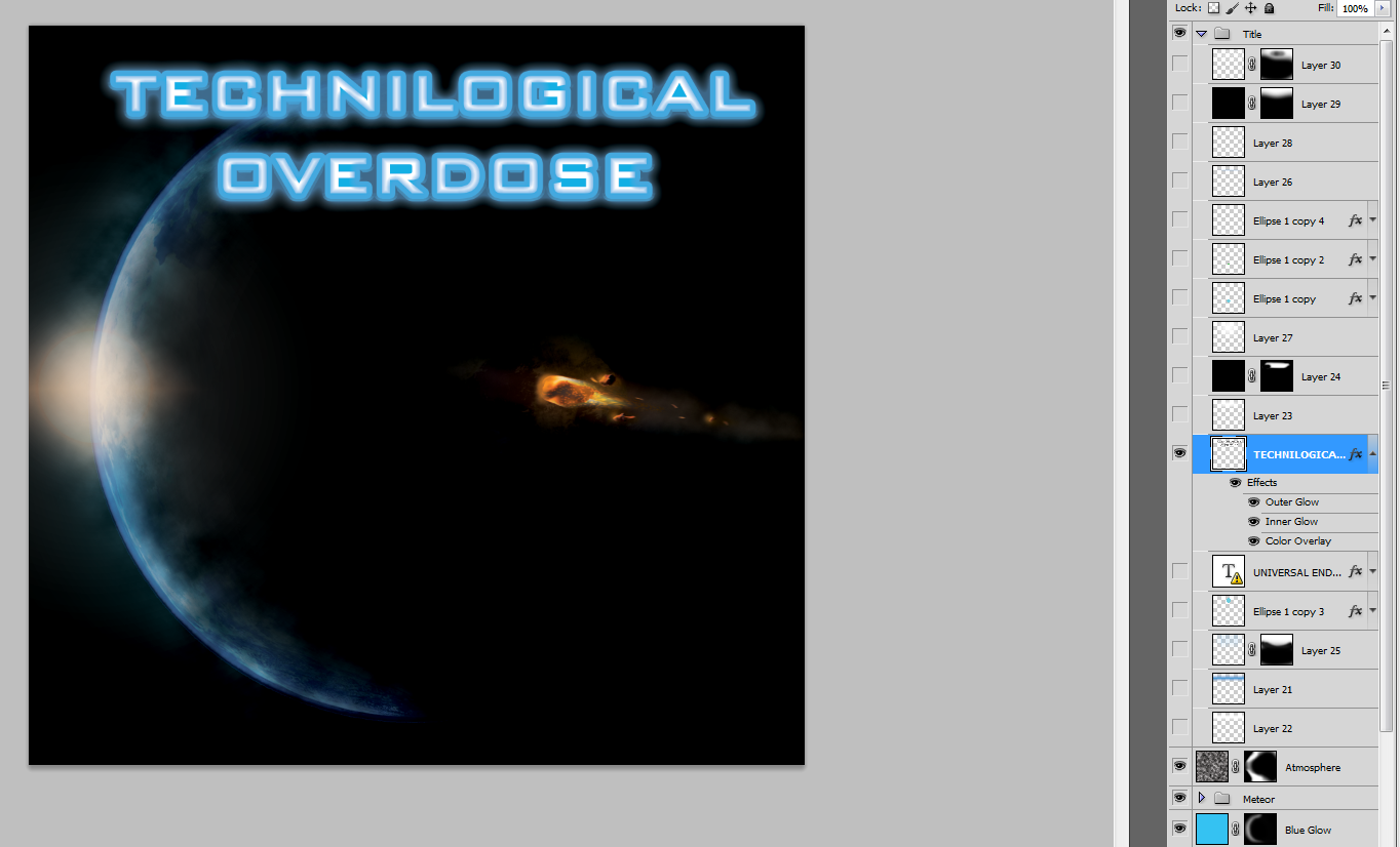
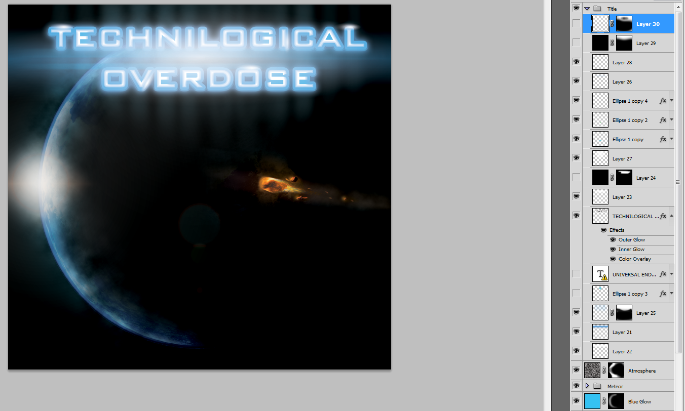
For the title i started with the words 'TECHNILOGICAL OVERDOSE' then gave the layer a grey stroke with the effects layer and rasterized it. I then added a bevel effect the text to make it look 3D and then rasterized the effects layer again. I added inner and outer blue glow as well as a blue overlay.
I then added various gradient effects with the gradient tool and set the blending modes to overlay or normal.
I added some blurred colours to the text to improve the look. I did this with the polygonal lasso tool then filled the selection and added motion blur of 999px at 0 Degrees. I used the brush tool to add dots behind each letter then added a large amount of motion blur at 90 Degrees.
I added specular highlights with the gradient tool on parts of the text as well as lens flare. Due to the image being CYMK i had to make the lens flare myself.
I added dust particles with the brush tool by setting the flow to 1% and the hardness to 100% then added motion blur to them to make the dust look like its moving. This layer was then masked away from the centre of the text because it was too bright. I also added some black overlays over the text to make the text a bit darker and to sharpen the gradients.

This image wouldn't look as bright when printed.

Wednesday, 20 February 2013

DVD Front cover

I started this image in a larger size than needed so I could resize it later when I make the full DVD case and since it was going to be printed I use the CYMK colour space as well as a DPI of 300.
I started off with this picture
I then used the magic wand tool to remove the black background then added a layer behind it to make a black background. I did this to allow me to add effects to the planet only or the background only. I then added a dark shade, on a new layer, over most of the planet to make it look like the sun is behind the planet.
After this I added a blue layer and masked it so it only showed up on the side of the planet and switched the blending mode to overlay. I noticed that this didn’t look smooth enough and was too bright. So I added a black layer then set the blending mode on that to overlay as well. This made the gradient sharper, the shape smoother and the planet slightly darker with have more contrast. I then added a blue overlay over the image and added a mask to make it only show on the edge of the planet to make a more blue looking atmosphere and make the atmosphere look larger.

I then decided to add a lens flare but as the colour mode is set to CYMK i wouldn't be able to render a lens flare using photoshop so I had to create the lens flare myself. I started out with a simple radial gradient then added a vector circle then made the fill blue and the outline red. I then added red inner and outer glow using the effects to make the circle smoother and then lowered the opacity down to 5% to emulate real lens flare. I then added a white diamond gradient. I put slight orange hues over them then added a large white gradient behind these to make it look like the light is lighting the camera lens around the light source.

For the meteor i imported this flame from cgtextures.com. And these rocks from http://pixabay.com/en/wandering-rocks-stones-death-valley-3711/
wandering rocks, stones, death valley, wind, usa
I straightened it out with the liquify tool by making the brush size quite large and lowering the pressure down then nudging the middle of the flame inwards. I also made the flame look more violent by stretching it out. This made it look like the asteroid fly very fast. I then masked out most of the flame to make it look more realistic and added some embers to make it look more lively. To make the embers I used the brush tool, set the blending mode of the brush to dissolve, set the flow to 1% and the hardness to 100%
I then added a stroke effect of 1px to them in the effects menu to make them larger and more noticeable. I then rasterized the layer style to covert the effects to pixels, making them editable. I followed the motion of the flame with the liquify tool to make the embers look like they have motion and set the blending mode of the layer to overlay.
I added some extra rocks behind the meteor by cutting them out with the polygonal lasso tool. I then shrunk them down and added orange overlays to them. I also added an orange glow to the front of the meteors with the brush tool by setting the hardness to 0%. I then added several orange glow and blur effects to the meteor with the brush and using the motion blur filter.

I finally added some smoke behind the meteor and around the planet to give the planet more of an atmosphere and the meteor a trail. I did this by rendering clouds on 2 overlay layers and masking one of them to the atmosphere of the planet and the other to the area behind the meteor. I then added some embers behind the meteor and made a gradient mask to make them look like they are cooling off. I then removed part of the mask on the planet to make it look like the meteor is lighting part of the planet with the brush tool set to about 20% opacity.

Thursday, 7 February 2013

Music Visualizer

The image above was made to be a desktop background for a 1680 x 1050 display, it is supposed to replicate a music visualizer. I wanted it to be high quality so i made the dpi 720 and saved it as a PNG. 
Here is how i made the image:
The shapes were made using the selection tool and then applying a stroke to the selection as well as filling it on a layer behind the stroke. These were greyscale to allow for colour modification later. Glow effects were added to the layers to get the effect that i wanted. A spectrum layer was then overlayed over the squares to make the colour effect that i wanted. I did also try other colours but i settled with the spectrum. I then made horizontal lines to give it a digital/hologram look and reduced the opacity to make them faint; these were also done in greyscale.
 
I then added small dots all over the screen using the brush tool, setting it to dissolve and reducing the flow to 1%. I then added motion blur to this layer to make it look like rain or dust and added a mask so it doesn't show up on the squares. This helped make the dark space a bit more lively.
 
I then copied the filled squares and then applied extreme vertical motion blur to make the shafts of light. I also copied the square outlines and added multiple blur affects to make the squares look a bit more interesting.
 
Finally i added a layer with a white circular gradient, then edited it to go along the bottom of the image, then created another layer and added more gradient to make the bottom of the bars to glow. I then finally added Gaussian Blur to these 2 layers to make them smooth.