I
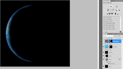
started off with this picture
I
then used the magic wand tool to remove the black background then
added a layer behind it to make a black background. I did this to
allow me to add effects to the planet only or the background only. I
then added a dark shade, on a new layer, over most of the planet to
make it look like the sun is behind the planet.
After
this I added a blue layer and masked it so it only showed up on the
side of the planet and switched the blending mode to overlay. I
noticed that this didn’t look smooth enough and was too bright. So
I added a black layer then set the blending mode on that to overlay
as well. This made the gradient sharper, the shape smoother and the
planet slightly darker with have more contrast. I then added a blue
overlay over the image and added a mask to make it only show on the
edge of the planet to make a more blue looking atmosphere and make
the atmosphere look larger.
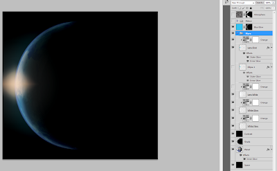
I
then decided to add a lens flare but as the colour mode is set to
CYMK i wouldn't be able to render a lens flare using photoshop so I
had to create the lens flare myself. I started out with a simple
radial gradient then added a vector circle then made the fill blue
and the outline red. I then added red inner and outer glow using the
effects to make the circle smoother and then lowered the opacity down
to 5% to emulate real lens flare. I then added a white diamond
gradient. I put slight orange hues over them then added a large white
gradient behind these to make it look like the light is lighting the
camera lens around the light source.
For
the meteor i imported this flame from cgtextures.com. And these rocks from http://pixabay.com/en/wandering-rocks-stones-death-valley-3711/
I
straightened it out with the liquify tool by making the brush size
quite large and lowering the pressure down then nudging the middle of
the flame inwards. I also made the flame look more violent by
stretching it out. This made it look like the asteroid fly very fast.
I then masked out most of the flame to make it look more realistic
and added some embers to make it look more lively. To make the embers
I used the brush tool, set the blending mode of the brush to
dissolve, set the flow to 1% and the hardness to 100%
I
then added a stroke effect of 1px to them in the effects menu to make
them larger and more noticeable. I then rasterized the layer style to
covert the effects to pixels, making them editable. I followed the
motion of the flame with the liquify tool to make the embers look
like they have motion and set the blending mode of the layer to overlay.
I
added some extra rocks behind the meteor by cutting them out with the
polygonal lasso tool. I then shrunk them down and added orange
overlays to them. I also added an orange glow to the front of the
meteors with the brush tool by setting the hardness to 0%. I then added several orange glow and blur effects to the meteor with the brush and using the motion blur filter.
I
finally added some smoke behind the meteor and around the planet to
give the planet more of an atmosphere and the meteor a trail. I did
this by rendering clouds on 2 overlay layers and masking one of them to the
atmosphere of the planet and the other to the area behind the meteor.
I then added some embers behind the meteor and made a gradient mask
to make them look like they are cooling off. I then removed part of the mask on the planet to make it look like the meteor is lighting part of the planet with the brush tool set to about 20% opacity.


No comments:
Post a Comment