Wednesday, 24 April 2013
The Developer Logo
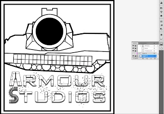
To make the logo of the developer i first took this screen shot of a tank in-game
I then imported it into Illustrator and then outlined it with the pen tool. I then outlined the turret and the composite armour and some of the other details. After outlining the major parts i then deleted the screenshot and just worked on adding details with the line tool, pen tool and shape tool. I only gave it minor details because as its a logo you don't want to much detail on it. I made the barrel bigger to make it seem like its closer to the camera and make the tank more intimidating.
After finishing the tank i added the text. The text was made from the same font as the game's title but i made the A and the S myself using the pen tool. I then went over the text adding lines and dots that i added using the line tool and the brush tool to make the text look like its made of armour.
I made it look like there was dirt over the text by creating lots of dots with the brush tool set to 3pt round then changed the sizes to make them vary. I made a small patch of these then turned them into a symbol and stamped them around the text with the symbol sprayer tool. I then varied the rotation of them with the symbol spinner tool and the positioning of them with the symbol shifter tool.
I finally made a border by creating a large white square and a slightly smaller black square with the square shape tool, selecting both of them and clicking the subtract button on the pathfinder.
Subscribe to:
Post Comments (Atom)


No comments:
Post a Comment